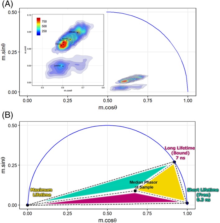
Figure 6.

FLFC‐derived phasor plots. (A) Phasor graphs showing populations of untreated cells and cells treated with STS to trigger apoptosis. A MATLAB routine permitted extraction of the phase angle and demodulation depth from each set of correlated cytometric waveforms at 6.25 MHz. Plots were generated in R (r‐project.org) and represent individual cells by density regions where the regions of more cells are represented by warmer colors (red). Inset shows magnified view of overlaid cell populations with the median phasor points (black dots) for each sample. (B) Phasor plot with highlighted (colored) areas used to evaluate the fractional contributions. Short lifetime (S) of 0.3 ns represents the free NAD(P)H lifetime. Long lifetime (L) of 7 ns represents the bound NAD(P)H lifetime. Maximum lifetime component is chosen as the third vertex of the triangle which encompasses the cell populations collected herein. Fractional contribution of free and bound NAD(P)H can be estimated using vector algebra in phasor space as well as visualized by the total area of the triangle opposite of the vertex that specifies a short, long, or maximum lifetime (e.g., the size of the cyan colored region—opposite triangle to short lifetime vertex—is proportional to the total contribution of a short lifetime component). [Color figure can be viewed at wileyonlinelibrary.com]
