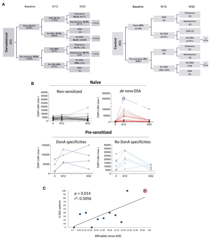
Figure 1.
Characterization of DSA generation in ADMIRE CD. (A) Distribution of Labscreen Mixed/Labscreen Single Antigen (LSM/LSA) results for indicated visits: pre-treatment (baseline), week 12 (W12) and week 52 (W52) in both control (right chart) and darvadstrocel (left chart) arms of the study. A total of 5 (darvadstrocel arm) and 12 (control arm) patients withdrew from the study and, therefore, no LSM/LSA data were available. (B) Kinetic curves illustrating HLA Abs titer represented as the sum of MFI (ΣMFI) of each micro-sphere measured with the LSM assay at the indicated time points. The dotted line in each graph indicates the MFI > 3000 threshold applied for positivity. Pat92 is evidenced in a blue line circle. (C) Graph representing HLA incompatibility between each patient and ASC. For the correlation of incompatibility, the percentage of individuals that generated DSA was plotted vs. the number number (range) of mismatched eplets. Highlighted with a red circle is Pat92. For linear regression we applied Pearson test (r2). P-values were determined by the Student's t-test.

