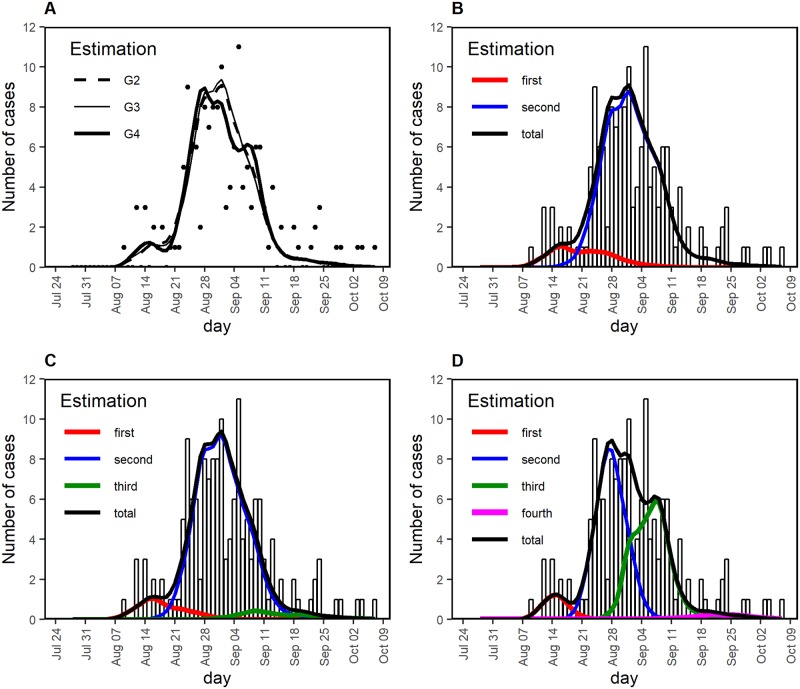
Fig 3. Comparison between observed and estimated epidemic curves of the 2014 dengue outbreak in Tokyo.
(A) Total number of cases with time of illness onset. Black dots show the observed number of cases; lines are derived from mathematical models with different numbers of assumed generations of infection, G2, G3, and G4, representing a total number of generations of 2, 3, and 4, excluding generation zero. (B–D) Comparison between observed and estimated cases by different numbers of assumed generations of infection, G2, G3, and G4, corresponding to panels B, C, and D, respectively. The observed number of cases is shown as bars. Red, blue, green, and magenta lines depict the estimated cases generated by first, second, third, fourth generation cases, respectively. Black line represents the estimated total number of cases.

