
Figure 2. Examples of changes in community composition over time.
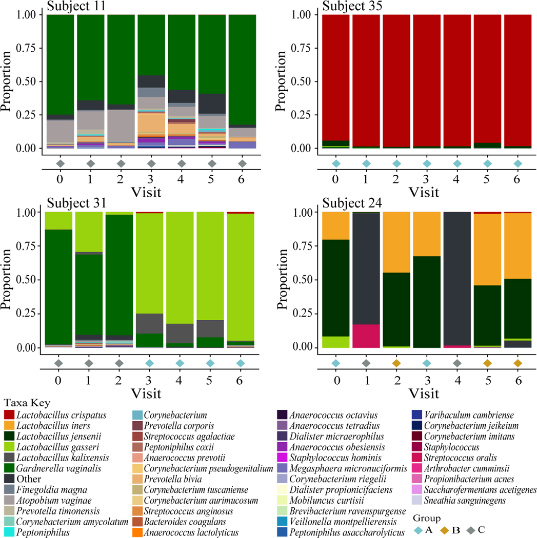
The stacked bar charts represent proportions of bacteria in each community over 7 monthly visits where zero was the baseline visit. Colors for each taxon are shown in the legend below the figure. The community group for each visit is highlighted by a colored diamond below each chart and the corresponding legend is listed in the bottom right. The profiles of these subjects were chosen to illustrate the temporal variability in community composition within subjects.