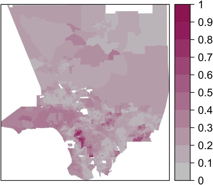
Fig. 1.
A map of the Los Angeles area with tracts colored according to the KL divergence between their ethnic composition and that of the whole region. Darker colors represent greater divergence. Values have been normalized by their maximum, so that they scale from 0 to 1. (Four ethnic groups are considered: Whites, Hispanics, Asians, and Blacks. Data are from the 2010 US Census.)

