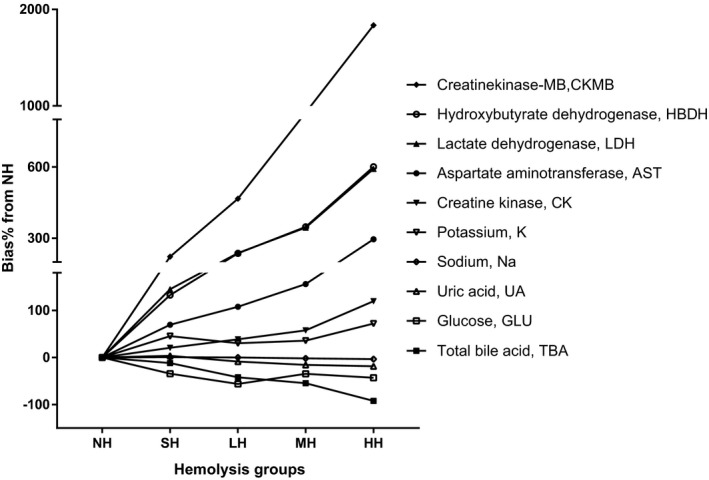
Figure 1.

Interferogram for hemolysis and the selected analytes. Y‐axis: %bias of analyte concentrations in comparison with the nonhemolysis group (NH); X‐axis: sample groups with different level hemolysis; lines in the graph represent different analyst. HH, heavy hemolysis group; LH, mild hemolysis group; MH, moderate hemolysis group; SH, slight hemolysis group
