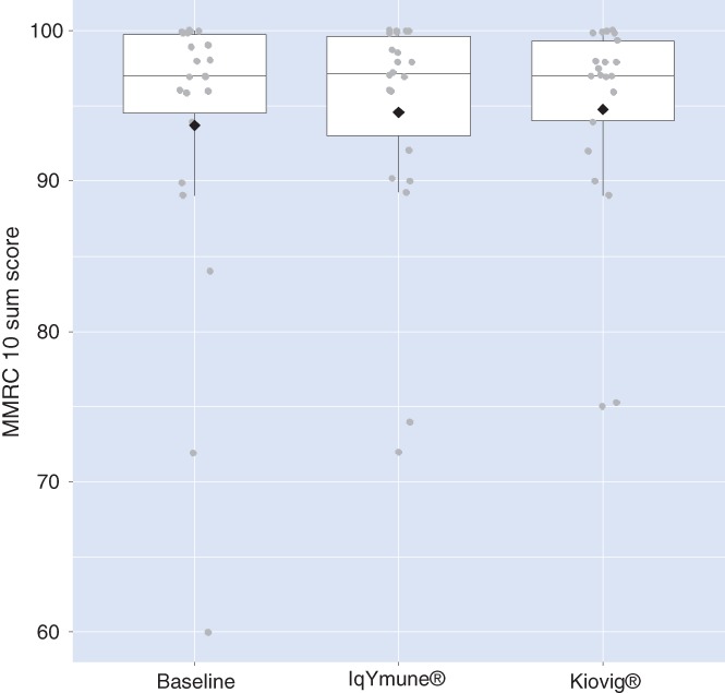
Figure 2.

Geometric boxplots of modified Medical Research Council (MMRC) 10‐sum scores at baseline and 6 months after each treatment sequence. Modified intent‐to‐treat, mITT population. The lower limit of a box represents the first quartile, that is, 25% of data lie below this value; the upper limit of the box represents the third quartile, that is, 25% of the data lie above this value; the horizontal line within the box indicates the median, that is, 50% of data lie above this value. The diamond represents the mean value of the distribution, and the dots outside the box represent outliers. This figure shows that the medians after IqYmune® treatment and Kiovig® treatment are similar to the baseline value and that the distributions are not significantly different
