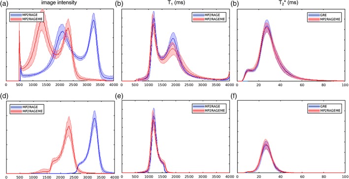
Figure 5.

Histograms. The image intensity (a,d), T1 (b,e), and T2 *(c,f)‐value distributions of the MP2RAGE, ME‐GRE, and MP2RAGEME acquisitions. Mean values and SD (shaded area) over all subjects were computed. Distributions were either taken from the whole brain mask (a–c) or the white matter mask only (d–f). Although the chosen parameters lead to significantly different image intensity distributions (a + d), the derived T1‐maps are remarkably similar (b + e). y‐Axes represent relative frequencies [Color figure can be viewed at http://wileyonlinelibrary.com]
