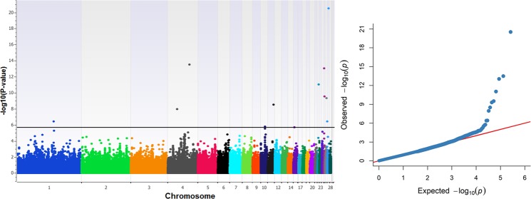
Figure 1.
Manhattan plot (left) and quantile-quantile plot (right) for BW. Manhattan plot shows the −log10 (observed p-values) of the genome-wide SNPs (y-axis) across the 28 autosomes (x-axis), and the horizontal line denotes the genome-wide significant threshold. With regard to the Q-Q plot, the y-axis represents the observed −log10 (p-values) and the x-axis shows the expected −log10 (p-values). Manhattan plot was constructed with SNP & Variation Suite (version 8.8.1) software (Golden Helix: http://www.goldenhelix.com) while Q-Q plot with the CMplot package (https://github.com/YinLiLin/R-CMplot) in R (http://www.r-project.org/).

