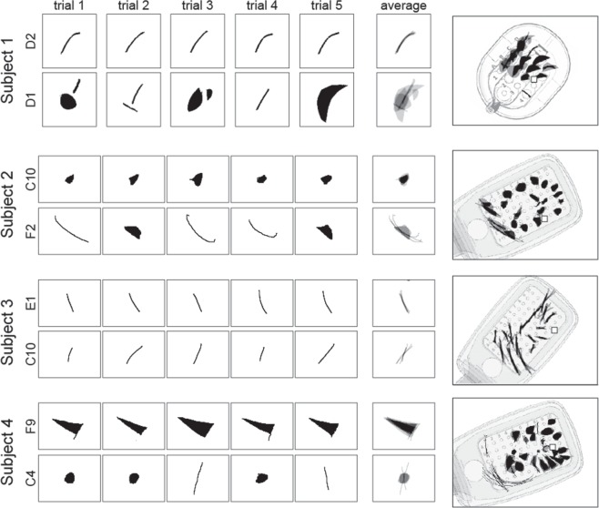
Figure 2.
Phosphene drawing variation within and across electrodes. Drawings from individual trials are shown for the most consistent (top row in each panel) and least consistent electrodes (bottom row in each panel) for Subjects 1–4. Mean images (labeled ‘average’) were obtained by averaging drawings from individual trials aligned at their center of mass. These averaged drawings were then overlaid over the corresponding electrode in a schematic of each subject’s implant (rightmost column).

