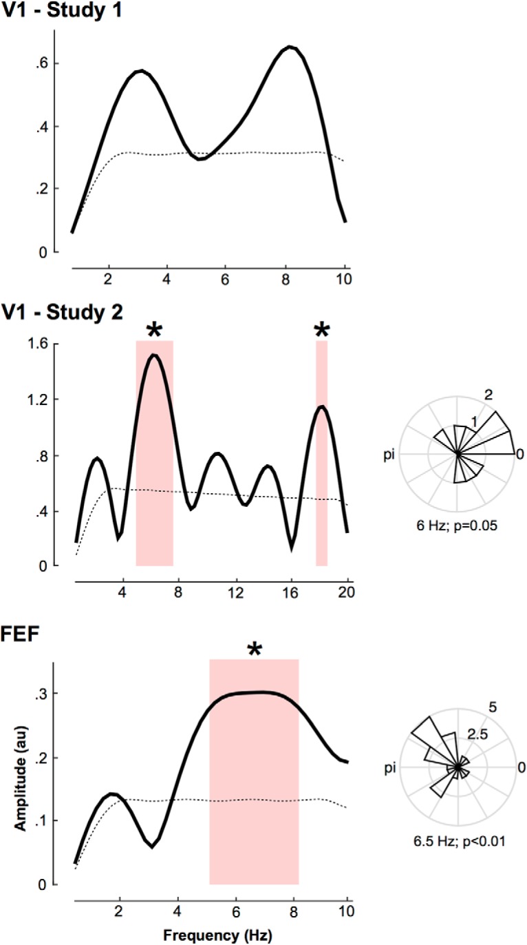
Figure 3.

Attentional periodicity in V1 and FEF. For each study, the graphs in the left column represent the amplitude spectra obtained by FFT decomposition of the averaged performance (as per hit rates modulation; see Materials and Methods) across participants. Note the distinct frequency axis in the middle, because of the increased time resolution (and corresponding Nyquist frequency) in that study. The bottom, dashed black line represents the amplitude spectrum of the surrogate distribution. The red shaded area represents the significant spectral components and the *peaks at 6 Hz and 18 Hz for the second V1 study and 6.5 Hz for the FEF study (p < 0.05). The right column represents the phase distribution of the peak frequency across participants. P values are obtained from Rayleigh test for non-uniform distribution of circular data.
