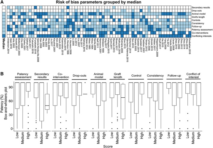
Figure 2.

Risk of bias (RoB) analysis. (A): Heatmap of RoB for all included studies. White, light blue, and dark blue indicates low, medium, and high RoB, respectively. The annotation bar to the left indicates the median for each RoB category. The order of the rows (RoB categories) denotes the median for each category, low to high from the top. (B): Boxplots (box‐and‐whiskers, i.e., the median, hinges, whiskers, and outliers) of patency distribution among RoB categories for each score (low, medium, or high). Dunn's test of multiple comparison was used to test low and medium groups against high RoB, to identify RoB categories associated with high patency as indicated by p‐value.
