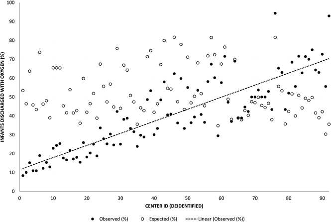
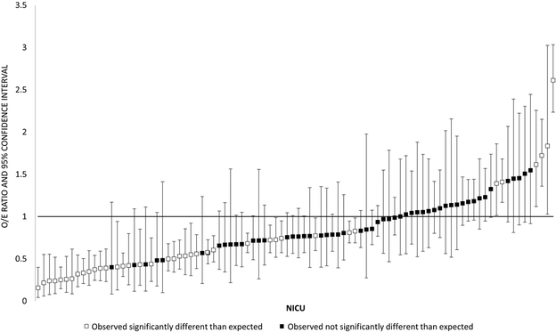
Figure II. Observed and expected home oxygen use for NICUs discharging ≥15 infants with BPD.
In figure 2a, the x axis represents individual deidentified NICUs, arranged in order from lowest to highest observed home oxygen use. The y axis represents the proportion of discharge with home oxygen, either observed (black circles) or expected based on model estimates (white circles). The line represents a best fit through the observed rates of home oxygen use.
Figure 2b depicts the observed/expected (O/E) ratio for home oxygen use for 92 NICUs discharging ≥15 infants with BPD. The x axis depicts individual deidentified NICUs, arranged from lowest to highest O/E ratio. The y axis represents the O/E ratio. Squares are point estimates, with vertical bars representing 95% confidence intervals. Black squares are NICUs whose observed home oxygen use was not significantly different from expected based on the model, defined as an O/E ratio confidence interval that crosses 1. White squares are NICUs whose observed home oxygen use was significantly different than expected based on the model, defined as an O/E ratio confidence interval that does not cross 1.


