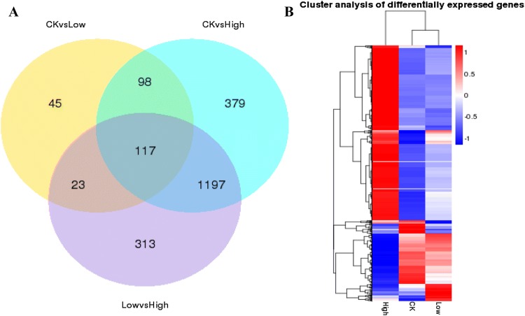
Fig. 4.
Differential gene distribution map. a Venn diagram of differential genes. The sum of the numbers in each large circle represents the total number of differential genes in the comparative combination, and the overlapping part of the circle represents differential genes common among the combinations. b Differential gene cluster analysis. Red represents high expression, blue represents low expression, and colouring from red to blue indicates larger to smaller log10 (FPKM + 1) values

