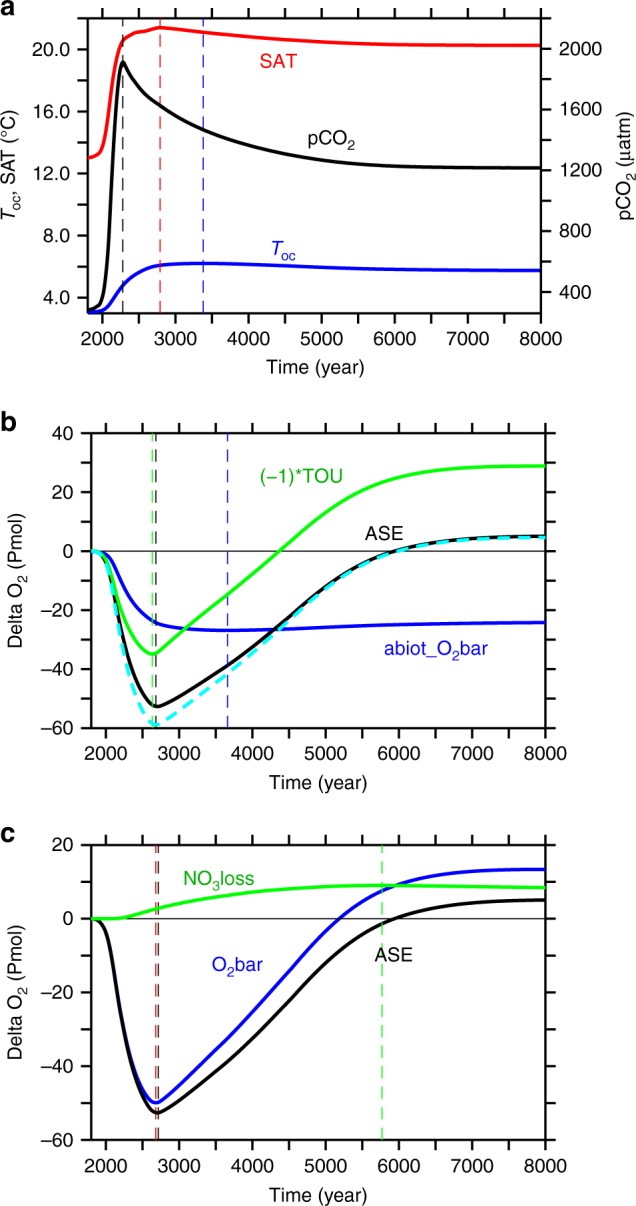
Fig. 1.

Simulated temporal evolution of global indicators. a Atmospheric pCO2 (black), global-mean surface air temperature (red) and global mean ocean temperature (blue); b anomalies relative to pre-industrial of the global-mean of an abiotic oxygen tracer (blue), total oxygen utilisation (times −1, green), cumulative air-sea oxygen exchange (black; positive into the ocean) and the sum of abiotic tracer and total oxygen utilisation (dashed cyan); and c oxygen accumulation via nitrate loss (green), equivalent to the difference between global mean oxygen change (blue) and cumulative air-sea oxygen flux (black). Dashed vertical lines denote the time of maxima/minima of the respective curve of same colour
