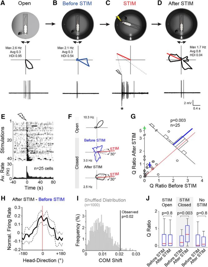
Figure 6.

Single-cell stimulation under “instability” of the HD system. A, Top, Schematic representation of the Open recording configuration consisting of a head-fixed rat on a rotating platform in the presence of a rich set of proximal and distal cues. Middle, Polar plot showing firing rate as a function of HD for a representative PreS HD neuron recorded during passive rotation. Peak and average firing rates and HD indices are indicated. Bottom, High-pass-filtered spike trace for the HD cell recording shown above (scale bars as in D). B, Same as A but for the Closed recording configuration. C, Same as A but for juxtacellular stimulation (STIM). The polar plot (middle) indicates the stimulus direction (red line). Bottom, High-pass filtered voltage trace showing a spike train evoked by a brief juxtacellular current injection (see Materials and Methods). The onset of current injection is indicated by the lightning bolt symbol. The asterisk indicates stimulus artifacts truncated for display purposes. Scale bars are as in D. D, Same as in B but after the juxtacellular stimulation shown in C. Note the redistribution of firing around the stimulus direction (red line). E, Raster plot (top) and average firing rate histogram (bottom) for all spike trains evoked in PreS neurons under passive rotation (n = 42 stimulations in 25 neurons). Recordings are aligned by the first spike of the evoked stimulus train (lightning bolt symbol). For display purposes, all stimulations are shown in the raster plot; however, multiple stimulations within individual neurons were averaged before being entered into the firing rate histogram, so that each cell contributed one data point. F, Polar plots showing the activity of another HD cell in the Open and before and after the stimulation (HD indices: Open, 0.65; before STIM, 0.07; after STIM, 0.61; average firing rates: Open, 2.9 Hz; before STIM, 1.4 Hz; after STIM, 1.2 Hz; peak firing rates are indicated). Dotted lines indicate the 30° interval centered on the stimulus direction (red line) used for computing the Q ratios (see G and text for more details). G, Scatterplot showing the Q ratios (i.e., the ratios between the average firing rate within and outside a 30° interval centered on the stimulus direction) computed for all cells before and after the stimulation. The red and green circles correspond to the representative examples shown in A–D and (F), respectively. Red line indicates the identity line, blue cross the mean ± SEM, and blue line the mean. The number of cells and the p-value (Wilcoxon signed-rank test) are indicated. H, Graph showing the subtraction of the average normalized tuning curves computed before and after stimulation (After STIM-Before STIM) aligned at the stimulus direction (0°). Note that a peak becomes apparent around the stimulus direction (red line). Dashed lines show SEM. I, Shuffled distribution of COM shifts (gray) computed by randomly shuffling individual recording epochs before and after stimulation (see details in Materials and Methods). The observed COM shift for the STIM-Closed dataset (vertical line) and the corresponding p-value are indicated. J, Box pots showing the Q ratios computed before and after stimulation for each dataset (STIM-Open, STIM-Closed, and No-STIM). Whiskers represent 1.5 IQR. Outliers are not shown for display purposes. p-values are indicated (Wilcoxon signed-rank test). More details about the STIM-Closed and No-STIM datasets can be found in Table 1.
