Figure 3.
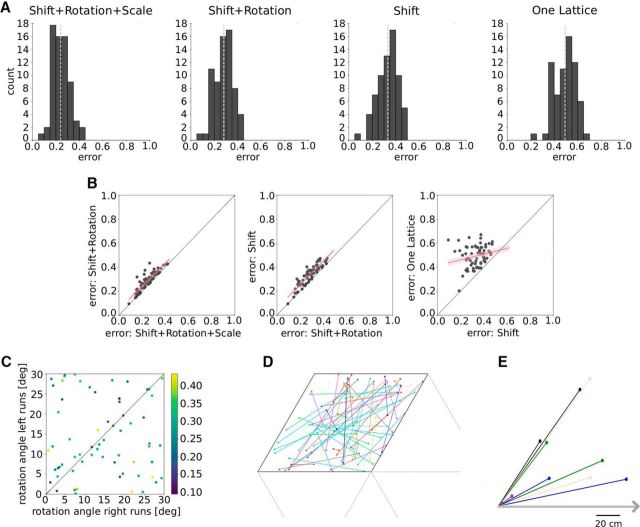
A, Error distributions for the best fits in the four model scenarios: Shift+Rotation+Scale, Shift+Rotation, Shift and One Lattice. The light gray dotted lines denote the mean of each distribution. B, Cell-by-cell analysis. Each dot in the scatter plots represents the best fits for one grid cell and the two scenarios indicated by the axis labels. Red lines indicate linear regressions with confidence intervals in light red. C, Rotation angles of the two-dimensional grid for left and right runs (Shift+Rotation). The color indicates the fit error. D, The two offsets (filled circles) in a pair of parallel slices (model S), within a rhomboidal unit cell of the unit lattice. Cells from the same animal have the same color. E, Offsets in a pair of parallel slices (model S) relative to the left end of the track, which is shown as a gray arrow. Simultaneously recorded cells from the same module have the same color.

