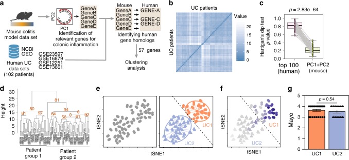
Fig. 3.
Conserved inflammatory gene signature distinguishes two UC transcriptomic profiles. a Schematic representation of the strategy used for patient group identification. Four publicly available data sets were combined. Gene ranking was done using the most variable genes-identified mouse data set that had a homolog in humans. b Sample dissimilarity heatmaps for visual analysis of clustering tendency (VAT), comparing the human data set using the top mouse gene homologs. c Hartigan’s Dip test for clustering tendency comparing the analysis using the top 100 variable genes and the top mouse gene homologs. d Bootstrapping analysis of hierarchical clustering, comparing the human data set using the top mouse gene homologs. Numbers in orange indicate the approximately unbiased (AU) p-value, shown as percentage. AU closer to zero indicates a cluster with low stability. e t-SNE plot using the top variable genes identified from the mouse data set. Each point represents a patient sample. t-SNE plot showing the separation of two patient profiles (left). Unsupervised hierarchical agglomerative clustering was used to automatically define patient subdivision (center). Dashed line delimits UC1 (triangle) and UC2 (circles) patients. f Average expression of mouse homolog genes used to subdivide patients, where the dark blue color indicates a higher average expression. Dashed line delimits UC1 (triangle) and UC2 (circles) patients. g Assessment of Mayo clinical subscore in patients from UC1 and UC2. Mann–Whitney test was used for comparison. Boxplot represent the median (center line, second quantile), first, and third quantiles (box) and whiskers extending 1.5 times the interquartile range (IQR). Error bars represent the standard deviation

