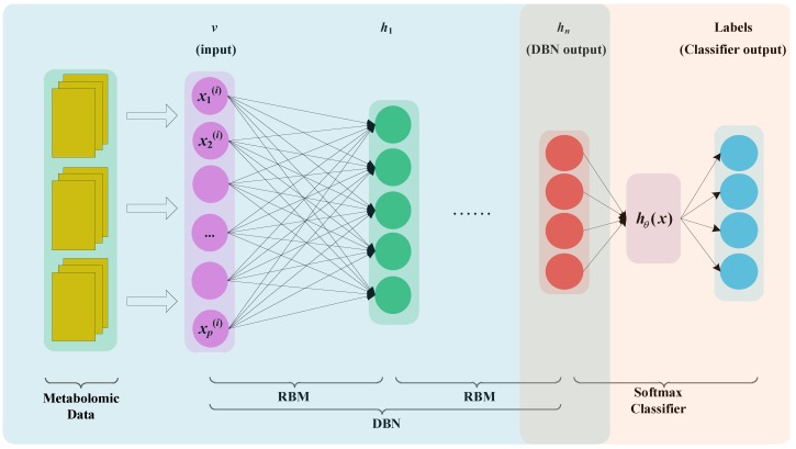
Figure 4.
MDBN model. The yellow rectangles represent the metabolomics data. After preprocessing, the data are fed to DBN. The purple circles represent input layer. The green circles represent output layer of the first RBM. The red circles represent the output of DBN. The blue circles represent the output layer of Softmax classifier.

