
Fig. 2.
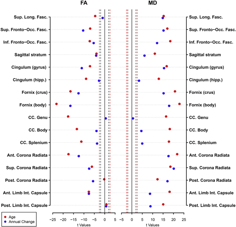
Dot plot showing the t-values from linear mixed effects analysis results for age (red) and annual rates of change (blue) on FA and MD. The dashed lines represent the thresholds for significance for p = 0.05 (black) and p = 0.01 (red). Moving from zero, points on the outside of the dashed lines represent significant effects. Covariates included sex, race, and scanner.