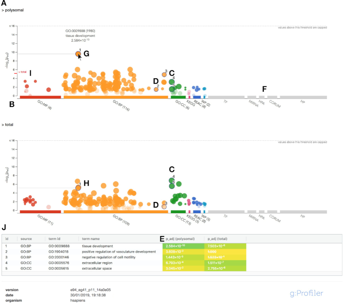
Figure 2.
Example of g:GOSt multiquery Manhattan plot. (A) Name of the query. (B) X-axis shows the functional terms grouped and colour-coded by data source. (C, D) The position of terms in the plots is fixed and terms from the same (GO) branch are close to each other. (E) P-values in the table outputs are color-coded from yellow (insignificant) to blue (highly significant). (F) Data sources that were not included in the analysis are shown in grey. (G) Hovering over the term circle shows a tooltip with the most relevant information. (H) In case of a multiquery, the same term is also highlighted on other plots. (I) The P-values from other queries are indicated in red next to the y-axis for easier comparison. (J) A click allows to pin the circles to the plot together with a numeric ID and creates a more detailed result table below the image.

