Figure 2.
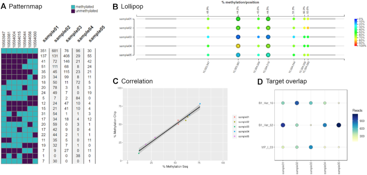
Overview of the graphical output of EPIC-TABSAT. (A) The different detected epialleles in the selected target region are shown in Patternmap and the number of alleles per sample is presented as a table. (B) The Lollipop plot shows the average methylation of each single CpG per sample and target. Rows represent samples and each single CpG is displayed as a circle spaced according to its actual chromosomal coordinate. The color of the circle indicates the percent methylation of the specific CpG site and primers are represented as gray boxes. The corresponding array-based data are displayed as an additional, color-dependent ring around the CpG circles. (C) The Correlation plot provides a visual representation of the correlation between sequencing and epigenome wide methylation data. (D) The number of reads spanning the whole target are shown in the Target overlap graph.

