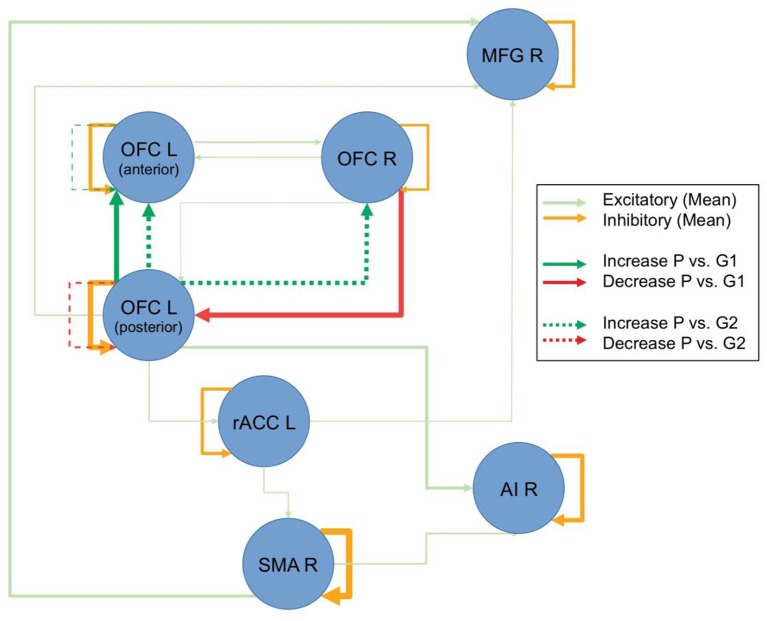
Figure 2.
Resting-state dynamic causal modeling (DCM) analysis. Figure displays the overall connectivity of the discovered network in the shaded colors, independent of groups and repetitions. The line thickness for the shaded lines is an indicator of the averaged estimated parameter. Pre-post group differences are displayed in strong colors. Connections, where there was a difference between the patients (P) and the control group with intervention (G1) are displayed with continuous lines, and comparisons to the control group without intervention (G2) are displayed with broken lines. Line thickness inversely scales with the p-values (Note: line thicknesses of the lines in shaded and strong colors are not related and should only illustrate the relative strength of the respective effects).

