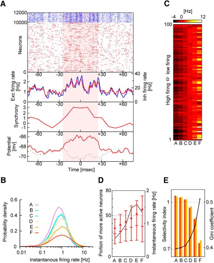
Figure 6.

Lognormal statistics of neurons selectively activated in highly synchronous events. A, Example of highly synchronous events (shaded period). From top to bottom, raster plots and population firing rates of excitatory (Exc, red) and inhibitory (Inh, blue) neurons, the magnitude of population synchrony in excitatory neurons, and the average time-varying membrane potentials of two excitatory neuron groups. A neuron group is depolarized during, but not outside, the highly synchronous event (bottom, solid red trace), whereas the other neuron group is hyperpolarized during the highly synchronous event (bottom, dashed red trace). B, The firing rates of excitatory neurons are distributed lognormally for different magnitudes of population synchrony. C, Modulations in the firing rate are shown for the 100 most active excitatory neurons during population synchrony with different magnitudes (ranked in A to F; see Fig. 4) in descending order of mean firing rates. D, The proportion of excitatory neurons generating more spikes during population synchrony of given rank than their means is shown (black solid line). Horizontal bars indicate the medians and the upper and lower quartiles of the distributions of the firing rates. Triangles represent mean values. E, Gini coefficients (solid line) and two selectivity indices (bars). These indices tell whether the less active half of neurons increases their contributions to network activity during population synchrony of given rank (orange) or whether the percentage of neurons contributing dominantly decreases during such epochs (yellow), compared with the long-term average. These two imply similar things (for more details, see Materials and Methods).
