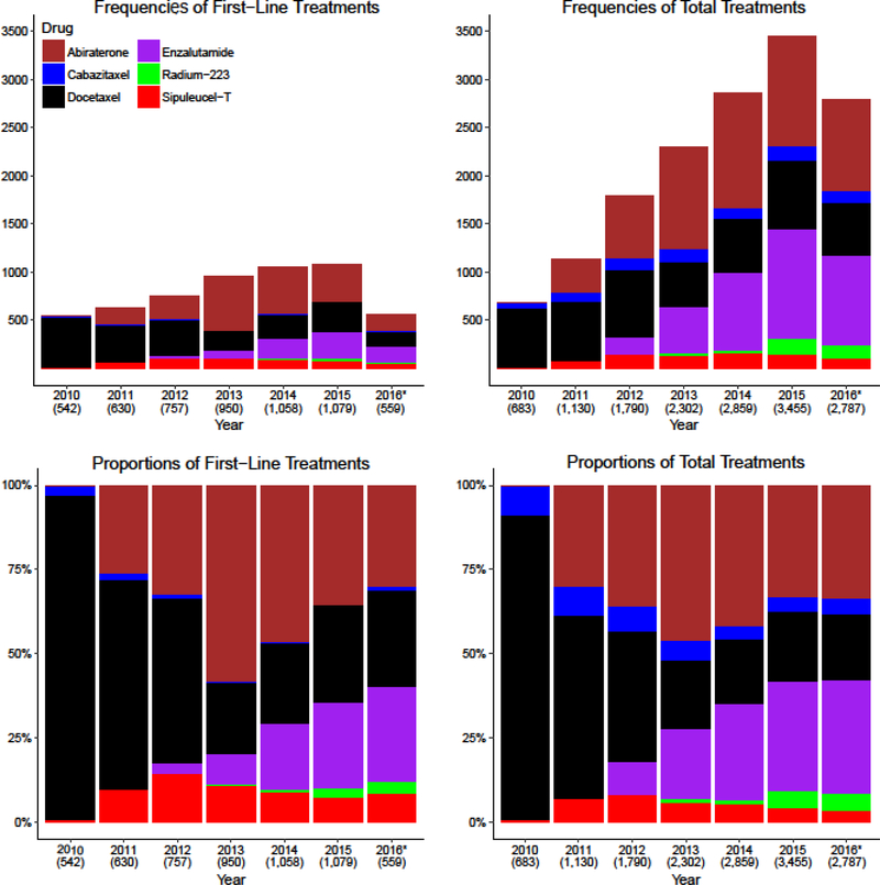
Figure 1. Frequencies and Rates of Therapy Use.
The top panels show the frequency of treatments used: the top left panel shows the frequency of patients who were started on a treatment as first-line therapy each year, and the top right panel shows the total use of treatment each year. The bottom panels show proportions of treatments used in relation to the other available treatments: the bottom left panel shows proportions of patients who started a first-line therapy each year and the bottom right panel shows the total proportions of the different therapies used each year. The proportions in the bottom panels sum to 100%. *2016 only includes data from the first six months of the year. The number of patients included in each column is included beneath the year on the X-axis of each bar graph.

