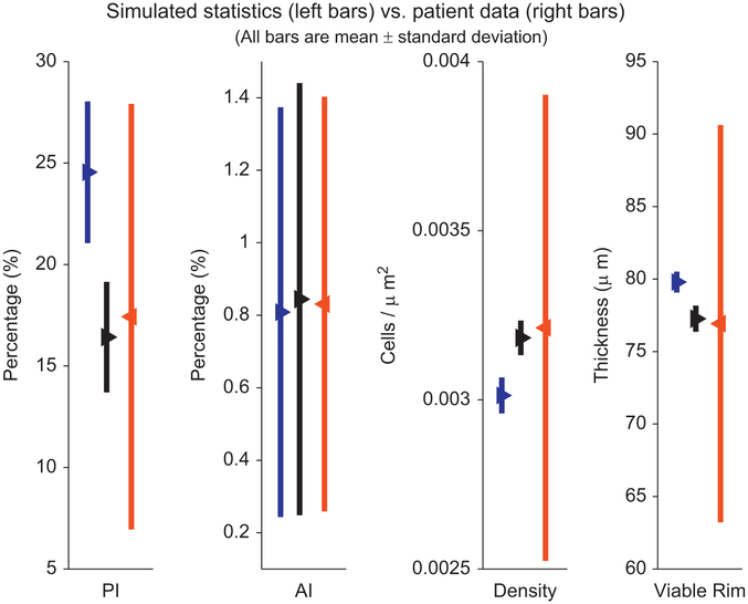
Fig. 1. Comparison of calibration methods:
We compare the simulated (left bars) and patient (right bars) PI (column one), AI (column two), cell density (column three), and viable rim thickness (column four) for our original calibration method (left blue bars) and the improved calibration (middle black bars), from T150 to 45 days in our simulations. While the original calibration (left blue bars) was consistent with the patient data (right red bars), the new calibration (middle black bars) gives simulated means that match the patient data much more closely. (For interpretation of the references to color in this figure caption, the reader is referred to the web version of this article.)

