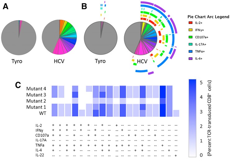
Figure 5.

SPICE‐generated graphical output. Boolean‐gated frequencies within FlowJo were formatted within Pestle and exported into SPICE. Various graphical options include pie charts without (A) or with (B) overlaying phenotype arcs, bar graphs (data not shown), or cool plot (C). A representative cool plot condensed to show only functional phenotypes present above background compares phenotypes for WT and several mutant HCV peptide‐stimulated HCV TCR‐transduced CD8+ T cells.
