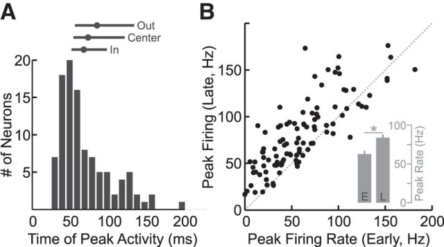
Figure 6.
Timing and magnitude of neural responses in M1. A, Histogram showing the time following perturbation onset when a neuron reached its peak activity. Note that this response could have occurred for any target location (median = 63 ms). Lines above indicate the median (dot) and quartile ranges (extent of lines) for each target location. B, Scatter plot comparing the peak firing rate in the early and late perturbation epochs. Neurons typically showed greater activity in the late epoch than the early epoch. Inset, Bar graph shows that this increase was significant across the population (paired t test, p < 0.05). Error bars represent 1 SEM.

