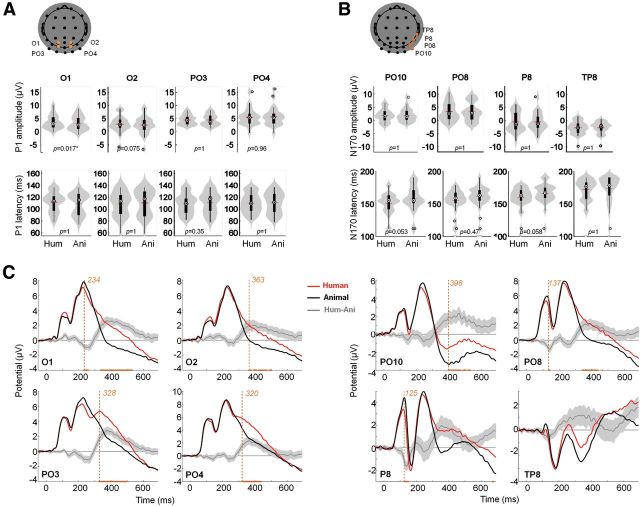
Figure 3.
Peak and time course ERP analysis. A, Peak analysis for the P100. Reported electrodes (O1, O2, PO3, and PO4) are indicated in orange overlaid on the scalp topography. Top line plots show peak amplitude distributions, bottom line plots show amplitude distributions for the two conditions (human vs animal faces) using violin plots in gray (Allen et al., 2012) and box plots in black. The small red horizontal bar indicates the mean; p values estimated from a permutation paired t test using the tmax method are shown at the bottom of each plot. Hum, human; Ani, animal. B, Same as A for the P170. Reported electrodes (PO10, PO8, P8, and TP8) are indicated in orange overlaid on the scalp topography. C, ERPs for targets (black) and distractors (gray). Orange curves correspond to the mean differential activity between the two conditions (±95% CI across participants shown as lighter orange shaded area). Time points for which a significant difference between the two conditions was found (paired permutation t test using tmax method, p < 0.05) are indicated on the x-axis. Earliest significant time bin is shown with a vertical dotted line.

