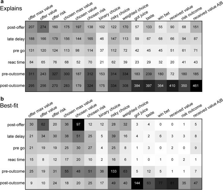
Figure 6.
Population summary of linear regressions (all time windows). a, Explained responses. Rows and columns represent, respectively, time windows and variables. In each location, the number indicates the number of responses explained by the corresponding variable in that time window. For example, offer value explained 274 responses in the postoffer time window. The same numbers are also represented in gray scale. Note that each response could be explained by >1 variable and thus could contribute to multiple bins in this panel. b, Best fit. In each location, the number indicates the number of responses for which the corresponding variable provided the best fit (highest R2) in that time window. For example, offer value provided the best fit for 62 responses in the postoffer time window. The numerical values are also represented in gray scale. In this plot, each response contributes to at most one bin. Qualitatively, offer value and chosen value were the dominant variables in the postoffer time window, while risky choice and weighted choice were most prominent in the preoutcome time window. The six variables at the right end of the table (got juice, taste, etc.), which all depended on the trial outcome, explained few responses in early time windows.

