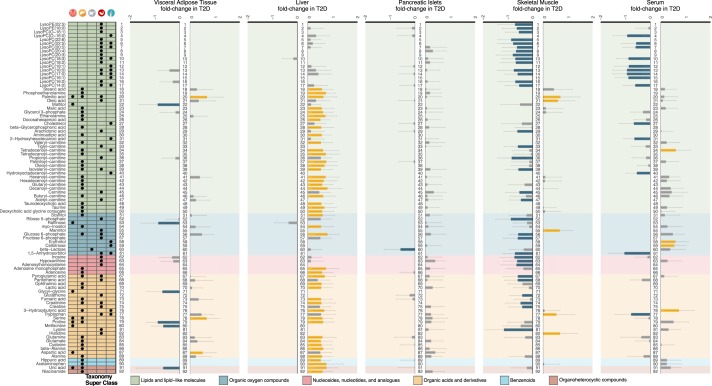
Figure 2.
Overview of the differential and fold-change analysis of the computationally annotated compounds from GC-MS and LC-MS for non-diabetes versus T2D subjects. Rows of the table on the left-hand-side contain the 92 metabolites that were significant in at least one tissue. Table columns represent each of the five tissues (VAT, liver, pancreatic islets, skeletal muscle and serum). A black dot implies statistical significance in the corresponding tissue (Mann-Whitney U test permuted p-value < 0.1; Methods - Statistical analysis). The color-coding in the table originates from a curated classification of the HMDB super-class taxonomy and the labels are explained in the legend51. The five barplots represent the fold-change in T2D of the μ = 0 and σ = 1 scaled log2 compound intensities. Order of the barplots matches that of the tissues in the table. Error bars represent 90% confidence intervals (Methods - Statistical analysis). Yellow bars imply statistical significance and increase, blue bars statistical significance and decrease, while grey bars did not cross the statistical significance threshold. Numbering assists following the variation of metabolite across tissues.

