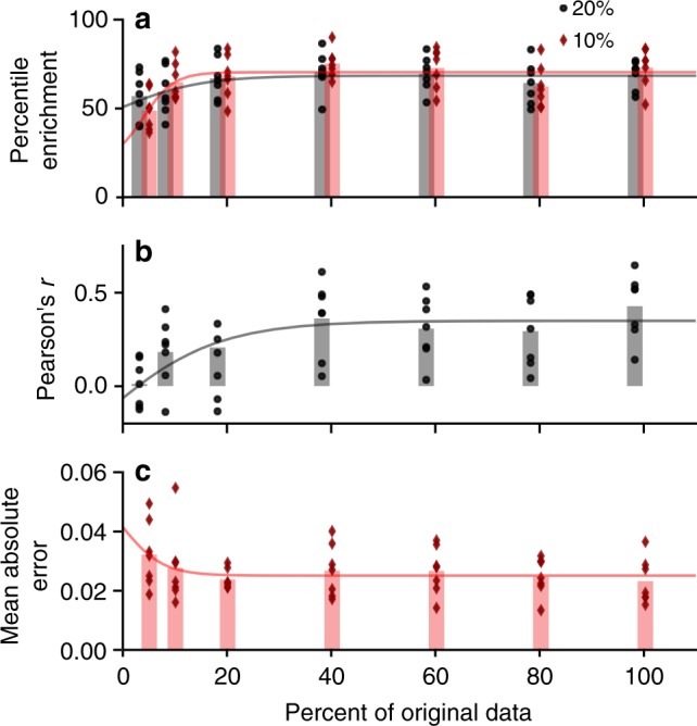
Fig. 9.

Learning curve analysis—model performance when including fewer training images—as given by a percentile enrichment, b Pearson’s r, and c mean-absolute error. Data points given performance of seven different test sets (for six donors and randomized), bars show the mean over the seven runs, and curve shows fitting of saturation curve. Given the trends and saturation at 100%, model performance is unlikely to increase simply with more training examples (more sperm cell images)
