
FIGURE 3.
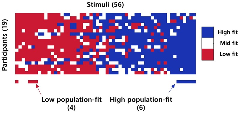
Stimuli grouping result. The image above indicates the fit level of each stimulus for each participant. The red bar below indicates low population-fit stimuli, while the blue bar indicates high population-fit stimuli. Only stimuli which was considered as high/low fit level for more than 85% of participants were selected as high/low population-fit stimuli.