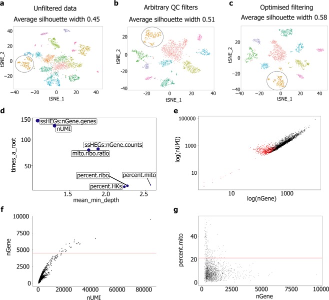
Figure 2.
Standardised quality-control metrics improve clustering quality of scRNA-seq data. tSNE plots showing principle component-based clustering and average silhouette width for: (a) unfiltered data, (b) data filtered using widely-used quality-control metrics and (c) the optimised approach described here (shown in d–g). Each point represents an individual cell, groups of cells with similar transcriptomes are referred to as a ‘cluster’ and distinguished by colour. Fibroblast populations are encircled in black. (d–g) Cell filtering using our optimised processing pipeline: (d) Multi-way importance plot showing the relative importance of each metric in distinguishing between low-quality events and droplets, (e) Plot of log(nGene) vs. log(nUMI). Data points identified as low-quality events are highlighted in red, (f) Plot of nUMI vs. nGene. The red line indicates the upper nGene threshold (defined as 2.5 MAD above the median) and (g) Plot of nGene vs. percent mito. The red line indicates the upper threshold (defined as 2.5 MAD above the median). Further data associated with this figure can be found in Fig. S5.

