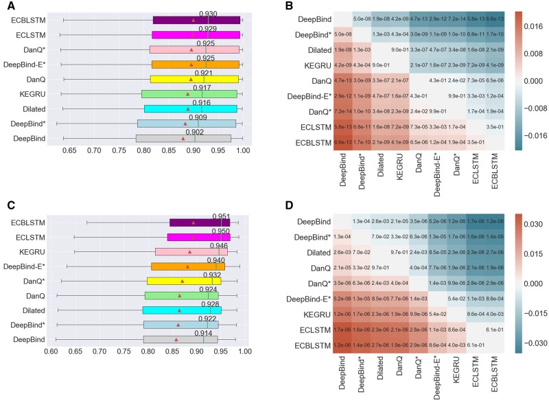
Fig. 2.
(A) The distribution of AUCs across 83 ChIP-seq datasets. (B) Heatmap annotated with P-values of pairwise model comparison using the Wilcoxon signed-rank test for ChIP-seq datasets. (C) The distribution of AUCs across 31 datasets for predicting RBP binding sites. (D) Heatmap annotated with P-values of pairwise model comparison using the Wilcoxon signed-rank test for predicting RBP binding sites. In subfigures (A) and (C), the triangle represents the average AUC for the respective model, the annotated vertical line represents the median AUC whose value is indicated. The models are sorted by their average AUC values. In subfigures (B) and (D), the color red or blue at position (i, j) in the heatmap indicates which model has a high average AUC, and its intensity indicates the magnitude of the difference

