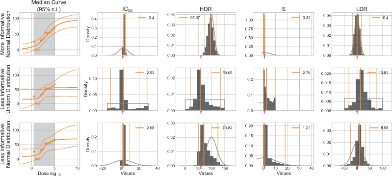
Fig. 4.
Effects of various prior. Three different prior settings (Table 2) are tested on the A10 synthetic dataset with R = 1. Dose–response curves are plotted against the data and with a 95% CI. The posterior of each parameter is represented by an histogram. The colored vertical segments represent the median value (continuous) and its 95% CI (hashed). The numerical median value is indicated in the legend. The expected values (used to generate the synthetic data) are identified by a red arrow on the x-axis. The light gray segment superimposed on the histogram illustrates the contour of the prior distribution

