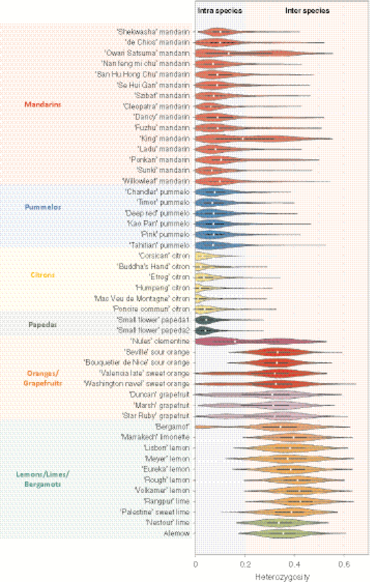
Fig. 5.
Violin plots of the heterozygosity distribution in the 48 diploid accessions computed from the average values in successive windows of 100 polymorphic positions along the genome. White dot, median; bar limits; upper and lower quartiles; whiskers, 1.5× interquartile range; light blue, intraspecies; light pink, interspecies.

