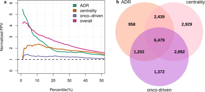
Figure 5.
Benchmark results obtained from the safety scores. (a) Putative targets are sorted from unsafe to safer according to each safety assessment method. The sorted lists are then trimmed on the 50th percentile and compared with a set of targets with known issues in order to obtain the normalized ppv-curves. The dashed line in black indicates the normalized ppv for a random ordering of target-disease pairs. (b) Three-set Venn diagram showing the number of targets covered the different safety scoring systems.

