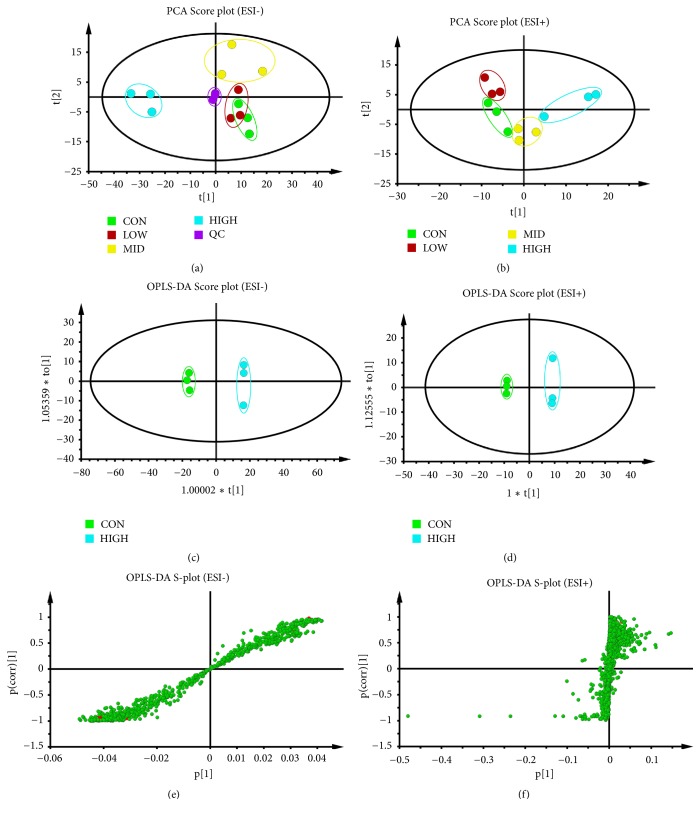
Figure 3.
Score plots of control group, groups treated with PG extract in different concentrations, and QC from PCA in the ESI− mode (a) and ESI+ mode (b). QC indicates the quality control group. OPLS-DA analysis of the data derived from the ESI- mode. OPLS-DA score plots (c, d) and S-plot of the OPLS-DA model (e, f) for the pair-wise comparisons between the control and high-dose group of PG. The axes that are plotted in the S-plot from the predictive component are p1 vs. p(corr)1, representing the magnitude (modelled covariation) and reliability (modelled correlation), respectively. The points in red indicated the identified potential biomarkers.

