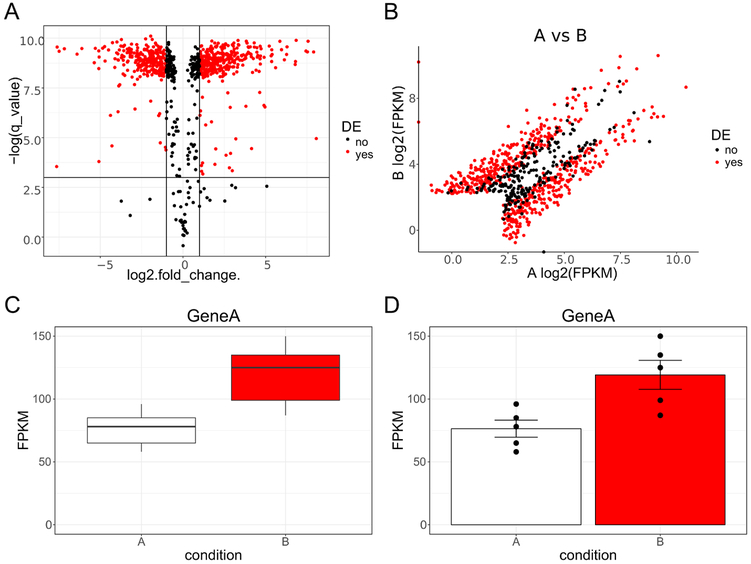
Figure 2. Example plots of hypothetical RNA Seq data.
A, Volcano plot of data with log base 2 transformed fold change (condition A vs condition B) plotted on the x axis and negative natural log transformed corrected p-value (q-value) plotted on the y axis. The solid horizontal line denotes where q-value is equal to 0.05. The two solid vertical lines denote where fold change is equal to 2 (or −2). Data points are colored red if they are both 2-fold different and have a q-value less than 0.05; otherwise they are black. B, Scatter plot of data with log2 transformed fragments per kilobase million (FPKM) plotted on the x axis for condition A and the y axis for condition B. As in A data points are colored red if they are both 2-fold different and have a q-value less than 0.05; otherwise they are black. C, Box plots for Gene A for condition A and B. FPKM are plotted on the y axis with the two conditions represented side by side on the x axis. D, Bar graphs denoting mean plus or minus standard error of the mean (SEM) for Gene A for condition A and B. FPKM are plotted on the y axis with the two conditions represented side by side on the x axis. Individual data points are superimposed on top of the bars for greater data reporting transparency. DE, differentially expressed.

