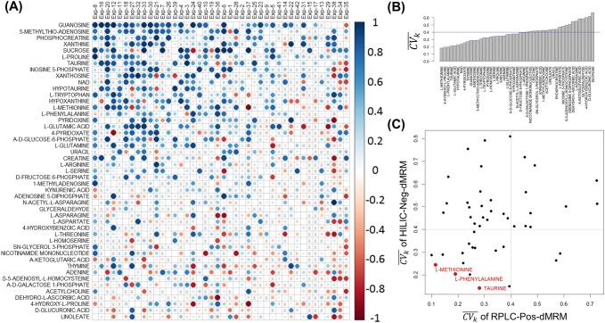
Fig. 4.
RPLC-HILIC correlation analysis. a Heatmap of all RPLC-HILIC Pearson correlation coefficients for 47 metabolites that were measured in at least 70% of all 42 experiments. The metabolites were sorted by the average correlation across all the experiments and the columns were sorted by the average correlation across all the metabolites. The size of the circles is proportional to absolute values of correlation coefficients. Larger circles in darker blues indicate good correlation between the RPLC-Pos-dMRM and HILIC-Neg-dMRM measurements. b Distribution of across the 42 datasets in both RPLC-Pos-dMRM and HILIC-Neg-dMRM methods. c A scatter plot of from the RPLC-Pos-dMRM and HILIC-Neg-dMRM measurements for all 47 metabolites. The three most reproducible metabolites by both methods are shown in red. See also Supplementary Table S4 for the list of 47 metabolites along with in both methods

