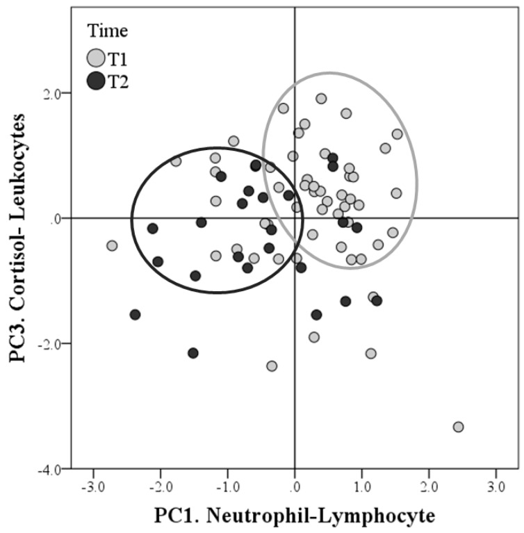
Figure 2.
Factor maps of the principal component analysis (PCA). Distributions of the scores concerning the PC1. Neutrophil-Lymphocyte (x-axis) and PC3.Cortisol-Leukocytes (y-axis) extracted after PCA. The grey circles show that the scores of the first sampling (Time 1 = T1) are concentrated on the first quadrant in which both coordinates are positive. This suggests that many observations in T1 had positive scores for both PC1.Neutrophil-Lymphocyte and PC3.Cortisol-Leukocytes. On the contrary, many points of the second sampling (Time 2 = T2) have negative coordinates, especially as regards the x-axis. This suggests that many observations had negative scores in T2, especially for the PC1.Neutrophil-Lymphocyte.

