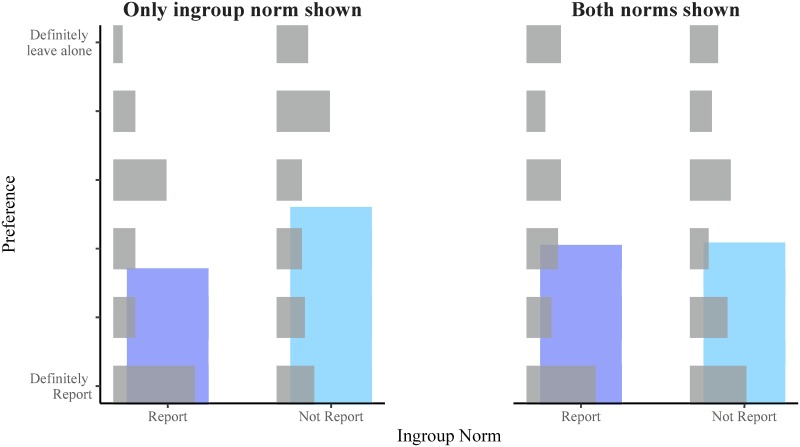
Fig 1. Superimposed bar chart representing responses to the moral dilemma in each condition of Experiment 1.
The horizontal grey bars represent the relative proportion of each response in each condition. The vertical blue bars represent the mean response in each condition in order to give a better sense of how the pattern of responses changed in each condition. The results of Experiment 1 are consistent with the alternative hypothesis that people’s preference will shift towards the overall norm.

