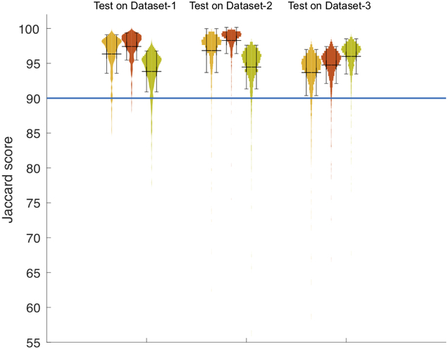
Figure 7:
Violin plot for all experiments. Cluster of three from the left shows the histogram of Jaccard scores taken from the results of testing the three networks on Dataset-1, Dataset-2 and Dataset-3, respectively. Yellow violin plots are the results from the model trained on Dataset-1. Red violin plots are the results from applying the model trained on Dataset-2 and green are the performance of the model trained on Dataset-3. Black bar is the marker for mean +/− standard deviation. The horizontal line at 90% indicates that the majority of samples have the test Jaccard score of 90% or higher.

