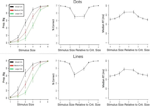
Figure 3.
Behavioral data from scanning sessions. Mean values across participants are shown with 95% confidence intervals for each condition. Dot trials are shown in the top panels and line trials in the bottom panels. The left column shows probability of “big” response across each stimulus size, with each line corresponding to a different criterion value. The shift in responses shows that the criterion manipulation effectively biased behavior. The middle and right columns show mean accuracy and median RTs, respectively, grouped as a function of the stimulus position relative to the decision criterion (note there are 8 possible distances from the criterion even though only 6 stimuli). Trials in which the stimulus and criterion were similar were more difficult, and are reflected by the longer RTs and lower accuracy near 0 in the graphs.

