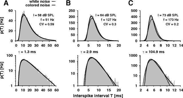
Figure 4.
Comparison of ISI histograms with colored- and white-noise ISI distributions. ISI histograms (gray bars) computed from a recording of one auditory receptor neuron during stimulation with three different sound intensities I (A–C) in comparison with the white-noise ISI density pwn (dashed black line; Eq. 1) and the colored-noise ISI distribution pcn (solid black line; Eq. 2). τ is the correlation time of the colored noise resulting from the fit of the colored-noise ISI distribution to the data. f, spike frequency; CV, coefficient of variation. The bottom row shows the same histograms on a logarithmic scale to emphasize the tails of the distributions. Note that the axes have different scales in A, B, and C.

