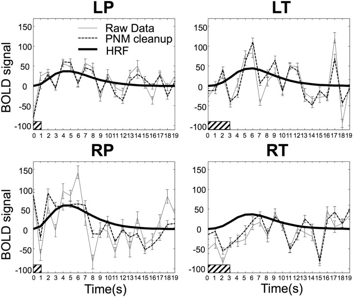
Figure 1.
Group average (N = 18) peristimulus plots for each of the four applied stimuli (RP, LP, RT, and LT) taken from the peak voxel for each contrast in the group analysis. For each of the four peristimulus plots, the raw data are shown by the light solid line, and the time course after “PNM cleanup” is shown by the light dashed line. Error bars represent SEs. In general, the data after cleanup have fewer large jumps and look smoother, reflecting the reduction in data variation. The heavy solid line is the fitted hemodynamic response curve to the data after cleanup, the filled bar at the origin indicates the timing and duration of the applied stimulus, and HRF = haemodynamic response function.

