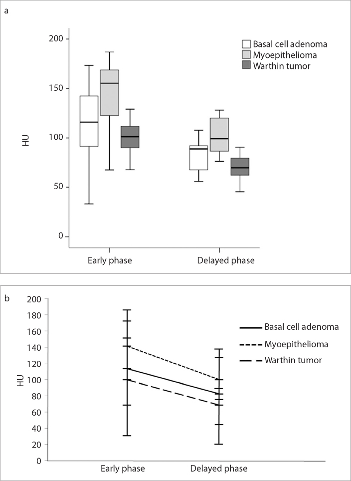
Figure 1. a, b.
Boxplot (a) shows the distribution of the attenuation values of the solid component of the tumors at early and delayed phases. The thick horizontal line is the median (50th percentile) of the measured attenuation values, and the tops and bottoms of the boxes represent the 25th and 75th percentiles, respectively. Whiskers represent the range from the largest to smallest observed data sets within the 1.5 interquartile range presented by the box. Graph (b) shows the lines connecting mean attenuation values between the early and delayed phases on two-phase CT; washout pattern of enhancement is clearly shown in all three tumor groups.

