
Figure 3.
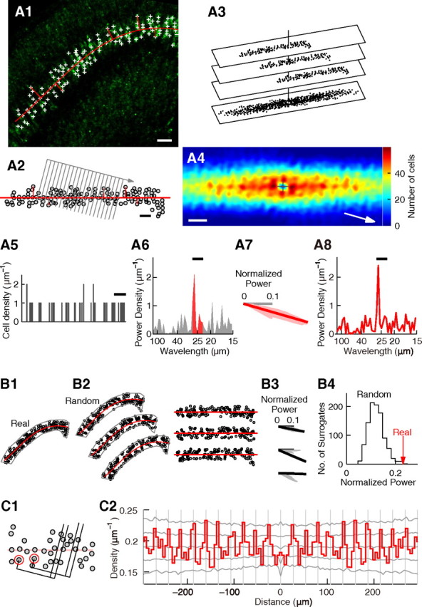
Statistical analysis of periodicity. A–C, Statistical analysis of periodicity performed on the slice shown in Figure 2H. A, Histogram of relative positions and power spectrum. A1, The same slice as in Figure 2H showing id2 mRNA expression (green). id2(+) cells in layer V are labeled with plus signs. The center line of layer V is indicated by a curved red line. Short straight red lines are lines used to measure the positions of id2(+) cells relative to the center line of layer V (see Materials and Methods). Scale bar, 50 μm. A2, Gray circles denote the positions of id2(+) cells in layer V measured relative to the center line of layer V. The center line of layer V is shown as a horizontal red line. The short lines used to measure the positions of id2(+) cells are also shown. Gray parallel lines denote the borders of bins used to make the cell position histogram. Gray arrow indicates the orientation of the alignment of bins. In this example, the orientation is approximately perpendicular to the stripes in A4. Scale bar, 50 μm. A3, Method to construct the histogram of relative positions (see Materials and Methods). A4, Histogram of relative positions generated for the positions of the id2(+) cells shown in A2, smoothed with the Gaussian function (σ = 5.5 μm). Origin is shown by the plus sign and the number of cells is shown in color. Scale bar, 50 μm. A5, Cell position histogram of the positions of the id2(+) cells shown in A2 generated with the bins shown in A2. The bin width was 1 μm. Scale bar, 30 μm. A6, Power spectrum of the histogram in A5. Bar indicates the wavelength range used for analysis (22.5–27.5 μm). The area under the bar is shown in red. A7, Red, Normalized power of the wavelength range of 22.5–27.5 μm measured by rotating the bins. The orientation of periodicity is shown by the thick line. Gray, Horizontal axis. A8, Power spectrum of cell distribution, prepared for the orientation of periodicity. Bar indicates the wavelength range used for analysis (22.5–27.5 μm). B, Generation and analysis of random surrogates to estimate statistical significance of periodicity. B1, Distribution of id2(+) cells in layer V shown in A1. Gray line denotes the area to be analyzed. Red line depicts the center line of layer V. B2, Left, Three examples of random surrogates. Right, The positions of surrogate cells measured relative to the center line of layer V. B3, Normalized power measured as that in A7. The orientation of periodicity is indicated by a thick line. B4, Significance test. The red arrow (“Real”) indicates the normalized power measured for the real data in the orientation of periodicity. The gray line (“Random”) is the histogram of the normalized power measured for 1000 surrogate datasets with random cell distribution. Note that almost all surrogates had normalized power smaller than that of the real data. The significance p = 0.001. C, Autocorrelation analysis. C1, Construction of the autocorrelogram (see Materials and Methods). C2, Autocorrelogram of cell positions shown in A2, prepared for the orientation of periodicity. Gray vertical lines are placed every 26.7 μm. Gray lines drawn sideways show the highest 2.5%, the highest 15.9%, the median, the lowest 15.9%, and the lowest 2.5% of autocorrelograms calculated for the 1000 surrogates.