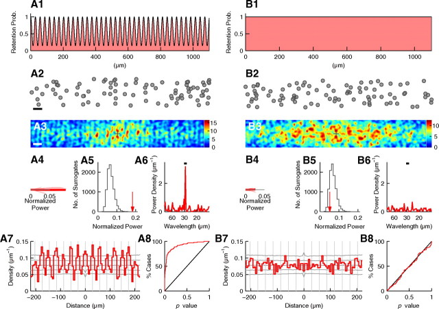
Figure 9.
Periodicity analysis of simulated data. A, Analysis of simulated data with periodicity. A1, Probability to retain randomly placed cells. Probability curve is a sinusoid with a wavelength of 29 μm. The probabilities at the peaks and troughs are 1 and 1/7, respectively. A2, An example set of cells generated according to the probability in A1. In the radial orientation, cells are randomly distributed across 150 μm. Scale bar, 50 μm. Note that periodicity is not apparent. A3–A7, Histogram of relative positions, normalized power, significance test, power spectrum, and autocorrelogram as shown in Figure 3, respectively. Scale bar, 50 μm; σ = 6 μm (in A3). In A4–A6, the wavelength range is 27.5–30.5 μm. In A5, the number of surrogates is 10,000. p < 0.0001. In A7, gray vertical lines are placed every 29.0 μm. A8, Cumulative histogram of p values calculated for 100 simulated datasets. B, The same analysis performed for simulated data without periodicity.

